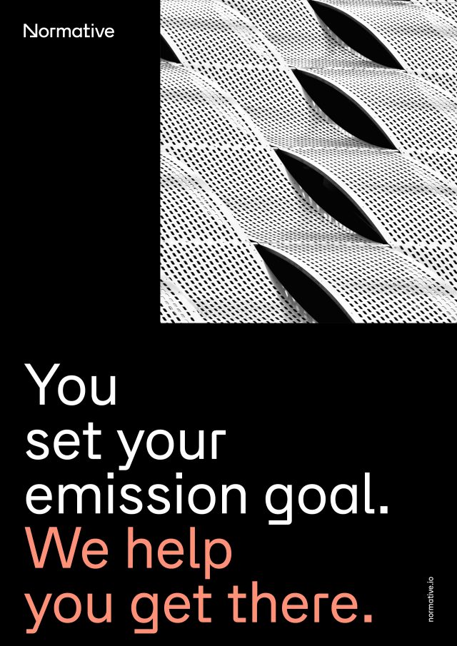
The Normative logo is a geometrical and clean logotype based on our primary typeface Zichtbaar. The characteristic and constructed N is what sets us apart and tells the story about who we are. The downward pointing arrow in the N illustrates our mission to decrease carbon emission and our goal to net zero.
Download Normative logo package below.
Logo and logomark
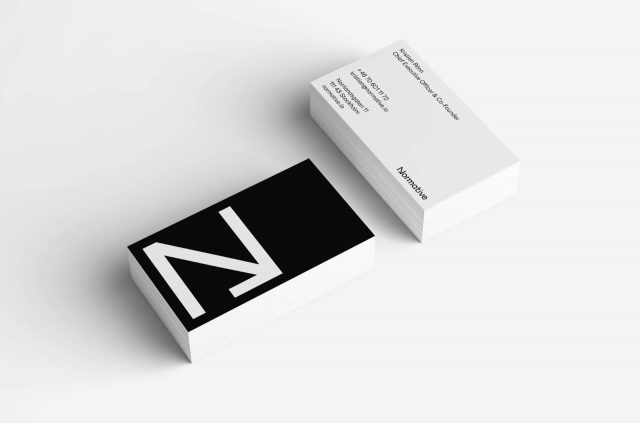
Our logo is available in positive and negative and the same goes for our “N” logomark. Our logomark is a simple and strong symbol underlining our very core, which we e.g. use as a favicon and as a profile icon on social media.
Normative’s logo and logomark are always used in black on coloured background. White logo must only be used on black background.
To learn more about how we animate our logo and logomark, go to “Motion” in the menu.
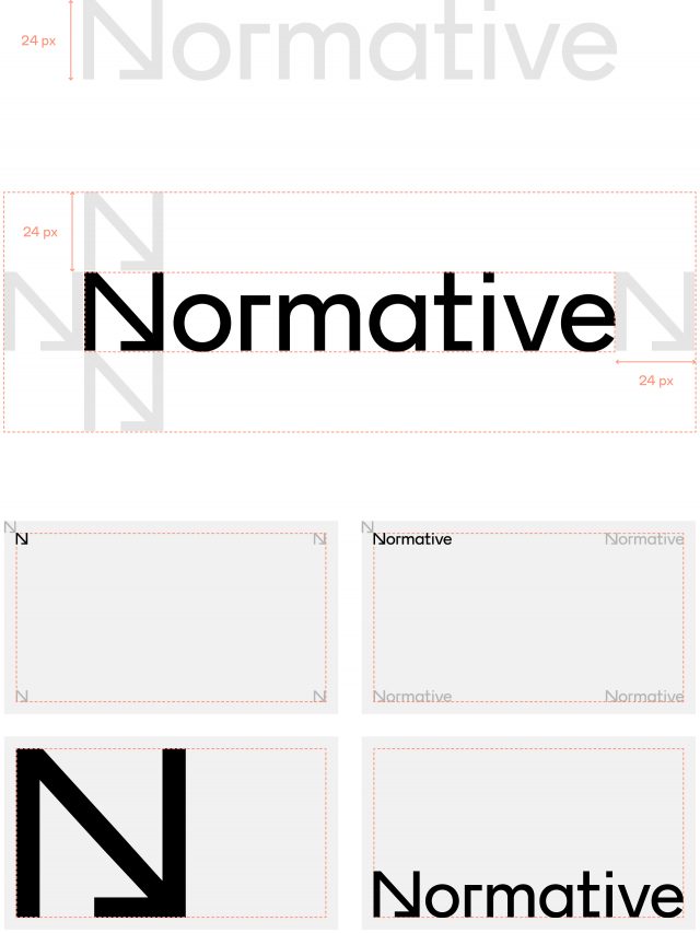
Minimum size and placement
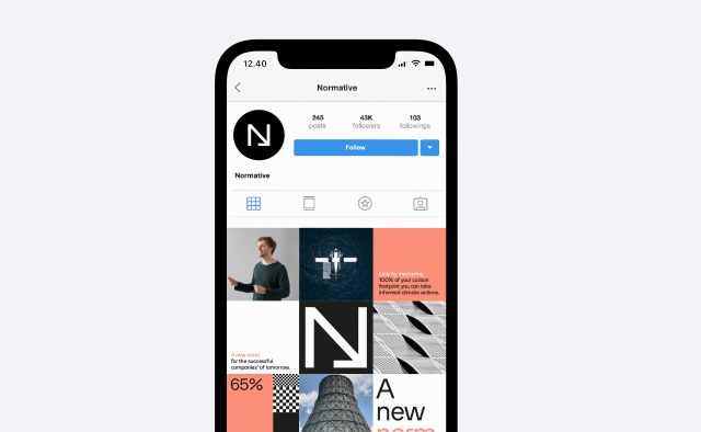
Profile icon
We use the white logomark on black as profile icon across platforms. When creating these, make sure to make a coherrent padding around the logo. Use the rounded profile icon as base to decide the padding, since the balance of our squared logo in a rounded frame can be a bit tricky.

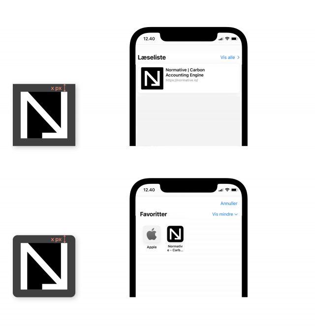
Favicon
Normative’s favicon is the white logomark on a black background. The favicon is used as a visual reminder of the website identity in the address bar or in tabs. Normative’s favicon has some extra padding around the logo to make sure the favicon works, with or without curved corners.
Download Normative favicon package below.
Examples of use