Our primary typeface is an essential part of the Normative brand identity, as it creates character and carries our visual identity across platforms.
Primary typeface
Our primary typeface is Zichtbaar by PLAYTYPE. Zichtbaar is a practical and effective grotesque typeface with characteristic traits that points to technology. The font some alternative glyphs, learn more about the features below under “Stylistic sets”. We use Zichtbaar in regular, medium, demibold and italics.
To gain access to the typeface, contact us at info@normative.io

Over all guiding principles of use
Regular — Headlines, Body text
Medium — Headlines
Bold — Small text that needs to be highlighted, CTAs
Stylistic sets
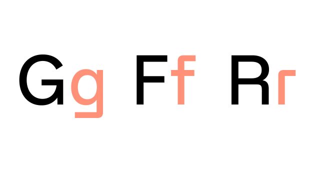
Our font, Zichtbaar have some characteristic details that is an important part of our brand expression in written messaging. Some of these letters are a part of the stylistic set (a, g and r as highlighted below). We use the stylistic set for headlines and shorter texts, but in smaller, longer text these characters can decrease the readability. In that case we instead use the default a, g and r.

System fonts
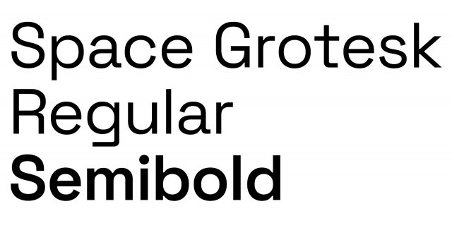
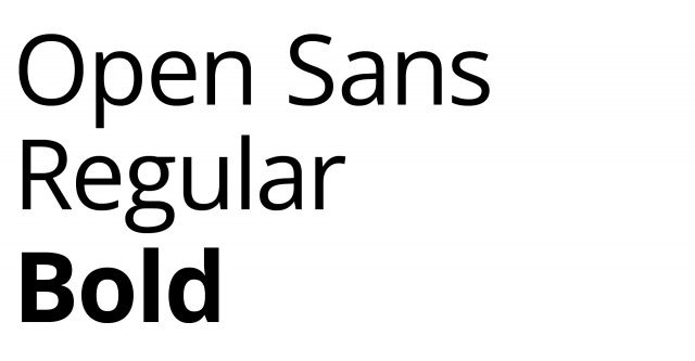
Our fall back system fonts are Space Grotesque and Open Sans. We only use them when our primary font Zichtbaar isn’t available. For example in Google Slides. Space Grotesque is our primary system font and Open Sans is only used in longer texts where we need to increase the readability.
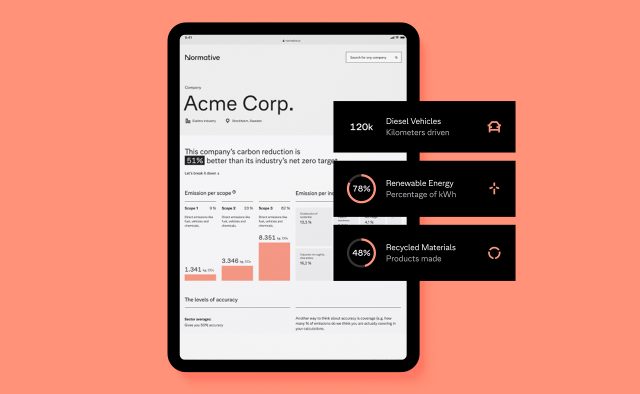
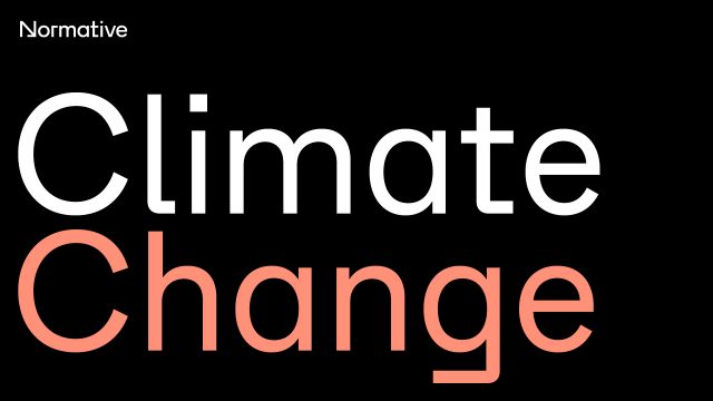
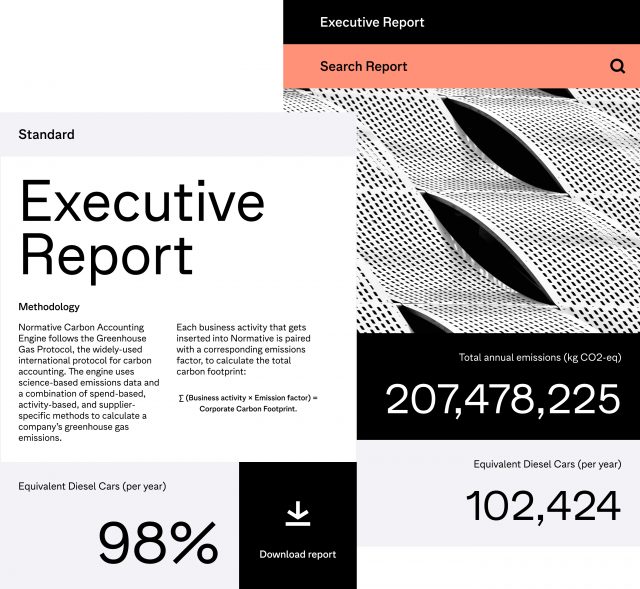
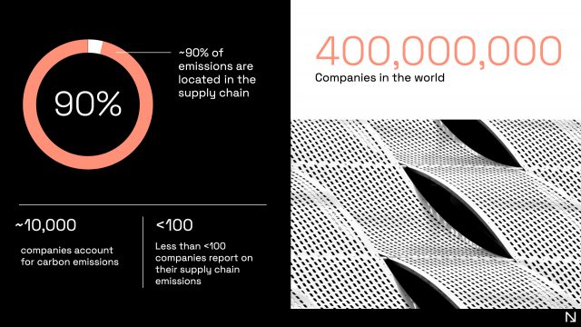
Examples of use