
We have a collection of icons that we use across all our platforms. The clean and simple design of our icons is based on the geometrical shapes of our logo and logomark.
Data and calculation systems are in our very nature, which also reflects in our icons. The icons are all monoline and constructed, designed within the same square pixel grid as our N logomark. Our icons are always clean, simple and to the point, with as few details as possible.
Download Normative icon package below.
Icons
Here you can see an overview of our icons.

Principles
Below you can see the basic principles of how to construct Normative icons.
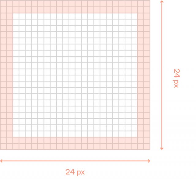
Padding
Normative’s icons must be created, from a 24px square format, and with 2px padding.
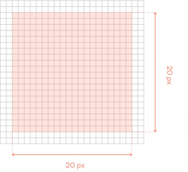
Live area
Normative’s icons is designed within a live area of 20px.
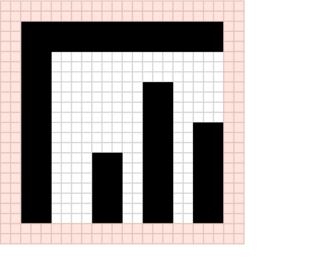
Square
Squared and linear icons should be designed within the live area.
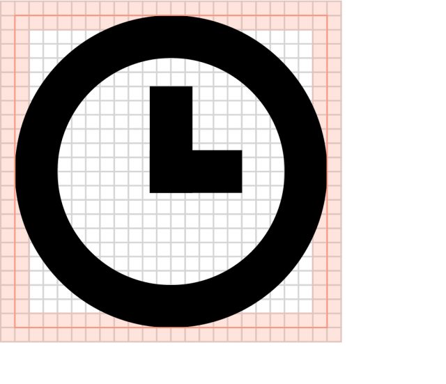
Circle
When creating a circluar icon, expand the live area by 1-2px to visually align the size of the icon with the squared ones.
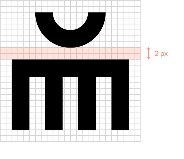
Space
Normative icons must have a minimum space of 2px.
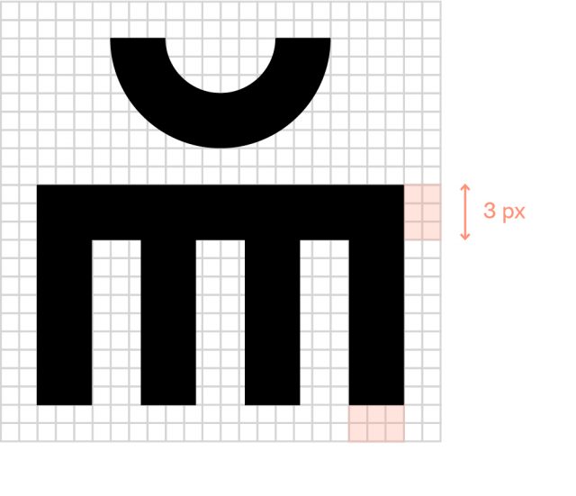
Stroke
Stroke size must be 3 px.
Examples of use
