Normative’s primary brand colours consist of a solid black, white and grey colour scheme, with a significant coral spot colour that signals constructive attention and action, the coral brand colour works as a contrast to soften the overall colour scheme.
Download our colours in .ase.
Primary colours
Normative coral
C: 0 M: 50 Y: 45 K: 0
R: 255 G: 145 B: 120
HEX: #FF9178
Pantone: 2023
Black
C: 0 M: 0 Y: 0 K: 100
R: 0 G: 0 B: 0
HEX: #000000
White
C: 0 M: 0 Y: 0 K: 0
R: 255 G: 255 B: 255
HEX: #FFFFF
Light grey
C: 1 M: 0 Y: 0 K: 7
R: 243 G: 243 B: 246
HEX: #f3f3f6
Secondary colours
Normative’s secondary colours consists of tints of grey. The tints can be used in charts and graphs and as subtle backgrounds if nessesary.
The Alternative coral colour is an AA rated version of our primary coral. It is only to be used on screens where we have text in 18 pt or smaller on a white background.
Grey 01
C: 0 M: 0 Y: 0 K: 79
R: 89 G: 89 B: 89
HEX: #595959
Grey 02
C: 2 M: 0 Y: 0 K: 46
R: 162 G: 164 B: 168
HEX: #a2a4a8
Grey 03
C: 0 M: 0 Y: 0 K: 31
R: 196 G: 196 B: 196
HEX: #c4c4c4
Alterntive Coral (AA Rated)
R: 231 G: 110 B: 80
HEX: #E76E50
Colour use
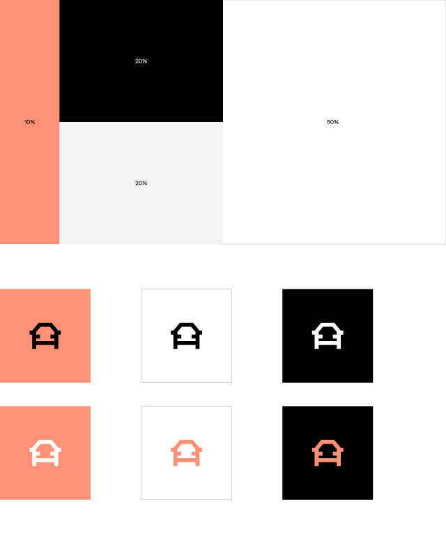
When using Normative brand colours, be aware of using the colours balanced, and in a percentage as shown below. The coral is only to be used in around 10% of the total colour use. So when using the coral, use it to highlight text or data. For inspiration see “Examples of use” or go to inspiration in the top menu.
Below is also showing the recommended way of using the branded colours together.
Text colour
Headlines and statements should be written in black or black combined with Normative coral. Normative coral should be used judiciously and sparingly in written communication, in conjunction with black, to emphasize particularly important points.
For visual balance, the coral color should always be used in the middle or at the end of the sentence, never at the beginning. Headlines and statements should never be written exclusively in Normative coral.

Examples of use